S4M03 Lecture #02 1998-09-14
Histograms and other graphical estimates of bivariate probability
density
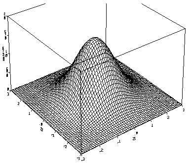
3-D plot of the standard bivariate normal probability density

Graphical displays of bivariate data
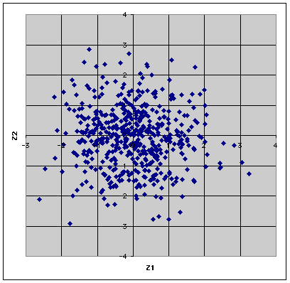
I generated n = 500 observations from a standard bivariate
normal distribution. Click here to get the
data.
Scatter plot

Bivariate grouped data table
TABLE OF Z2R (ROWS) BY Z1R (COLUMNS)
|
|
-2.5
|
-2.0
|
-1.5
|
-1.0
|
-0.5
|
0.0
|
0.5
|
1.0
|
1.5
|
2.0
|
2.5
|
3.0
|
3.5
|
TOTAL
|
|
-3.0
|
0
|
1
|
0
|
0
|
0
|
0
|
1
|
1
|
0
|
0
|
0
|
0
|
0
|
3
|
|
-2.5
|
0
|
0
|
0
|
0
|
2
|
0
|
1
|
0
|
1
|
0
|
0
|
0
|
0
|
4
|
|
-2.0
|
1
|
0
|
2
|
3
|
0
|
2
|
2
|
2
|
1
|
0
|
0
|
0
|
0
|
13
|
|
-1.5
|
0
|
0
|
2
|
4
|
14
|
8
|
12
|
7
|
3
|
0
|
0
|
0
|
1
|
51
|
|
-1.0
|
1
|
2
|
4
|
5
|
7
|
7
|
13
|
3
|
2
|
1
|
3
|
1
|
0
|
49
|
|
0.5
|
0
|
1
|
7
|
7
|
11
|
19
|
22
|
6
|
9
|
1
|
1
|
1
|
0
|
85
|
|
0.0
|
0
|
2
|
11
|
17
|
19
|
23
|
15
|
13
|
8
|
4
|
0
|
0
|
0
|
112
|
|
0.5
|
0
|
0
|
7
|
10
|
18
|
22
|
12
|
8
|
5
|
3
|
0
|
0
|
0
|
85
|
|
1.0
|
0
|
2
|
4
|
4
|
6
|
12
|
8
|
4
|
3
|
1
|
0
|
0
|
0
|
44
|
|
1.5
|
0
|
2
|
3
|
6
|
4
|
7
|
6
|
4
|
2
|
2
|
0
|
0
|
0
|
36
|
|
2.0
|
0
|
0
|
1
|
1
|
2
|
1
|
2
|
1
|
0
|
0
|
0
|
0
|
0
|
8
|
|
2.5
|
0
|
0
|
1
|
2
|
1
|
1
|
2
|
1
|
1
|
0
|
0
|
0
|
0
|
9
|
|
3.0
|
0
|
0
|
0
|
1
|
0
|
0
|
0
|
0
|
0
|
0
|
0
|
0
|
0
|
1
|
|
TOTAL
|
2
|
10
|
42
|
60
|
84
|
102
|
96
|
50
|
35
|
12
|
4
|
2
|
1
|
500
|
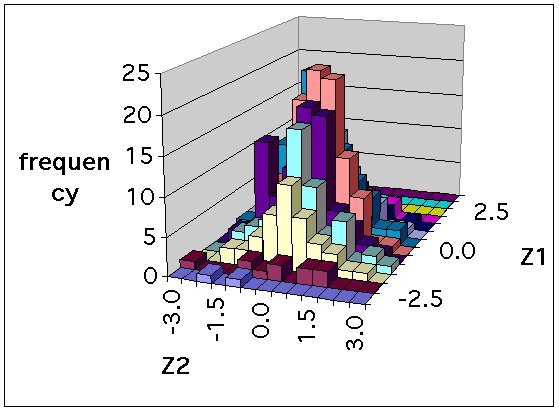
Bivariate histogram

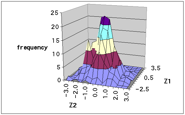
Bivariate frequency polygon

Some Comments
- Even 500 observations aren't enough to give a good estimate of
a bivariate probability density.
- The table gives much the same information as the scatter plot,
but it is flipped vertically: the ordinate (Z2 axis) of the
scatter plot increases upwards while the value of Z2 increases
down the rows of the table. The bivariate histogram and frequency
polygon were prepared directly from the table, using Excel.
- The scatter plot will only look circular if the aspect ratio
of the plot is set correctly. Otherwise it will appear elliptical.
- When you look at the scatter plot you will be tempted to see
patterns. Remind yourself that these are random observations and
any patterns (other than the overall elliptical or circular shape
of the scatter plot) happened by chance.
- Perspective drawings of 3-dimensional objects are more useful
if you can rotate them and look at them from all directions.
- The most prominent feature in the polygon is the second peak,
the "spike" to the left of the main peak. This isn't as prominent
in the histogram. In the scatter plot it isn't so much the extra
peak that is noticed, rather, the "hole" between the two peaks.
But neither the extra peak nor the hole are of interest if we know
that the data are really bivariate normal. Why can I say this?
- Are there any other comments you can make?
