Here are some useful pivot tables and graphical displays for the Niagara River Pollution data. You should be able to figure out how to make the tables with the Pivot Table Wizard, but there are a few tricks to learn so don't wait too long before asking me for help if you get stuck. Any of these summaries would be suitable for your Assignment 1 report, or you might look at these and think of something better. Could you add vertical standard error bars to the graphs, for example?
I did these examples with Excel 98 for Macintosh. Your version of Excel may behave a bit differently.
I used the Excel Workbook that I gave you, but I changed the column headings to make them more verbose and descriptive. When I imported the file to Splus I changed them to be short and cryptic.
You can represent missing data in Excel as empty cells or as non-numbers such as "NA". Empty cells will give warnings when you take logs, while non-numbers may give warnings when you take averages or do other statistics.
1999-03-05 The original data file had the codes for stations "FE" and"NOTL" switched. I have corrected the data files and revised all the graphs and tables on this page to show the correct stations.
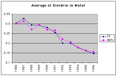
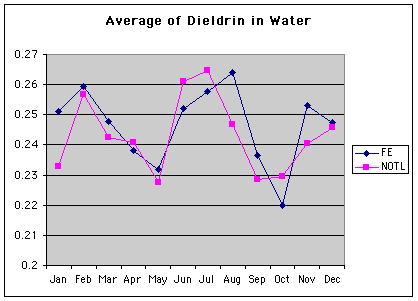
This is a one-way pivot table constructed using the same variable for both Rows and Data.
|
Count of Dieldrin in Water - Limit |
|
|
Dieldrin in Water - Limit |
Total |
|
L |
7 |
|
N |
958 |
|
Grand Total |
965 |
|
Average of Dieldrin in Water |
|
Station |
|
|
Years |
Date |
FE |
NOTL |
|
1986 |
|
0.304516129 |
0.300384615 |
|
1987 |
|
0.326458333 |
0.31212766 |
|
1988 |
|
0.293137255 |
0.27 |
|
1989 |
|
0.292708333 |
0.292790698 |
|
1990 |
|
0.280816327 |
0.26877551 |
|
1991 |
|
0.256041667 |
0.265869565 |
|
1992 |
|
0.199361702 |
0.220612245 |
|
1993 |
|
0.2 |
0.205116279 |
|
1994 |
|
0.176888889 |
0.17775 |
|
1995 |
|
0.161304348 |
0.162244898 |
|
1996 |
|
0.146666667 |
0.155 |
|
Average of Dieldrin in Water |
Station |
|
|
Date |
FE |
NOTL |
|
Jan |
0.251219512 |
0.232820513 |
|
Feb |
0.259459459 |
0.256666667 |
|
Mar |
0.247619048 |
0.242368421 |
|
Apr |
0.23804878 |
0.240952381 |
|
May |
0.23175 |
0.2275 |
|
Jun |
0.252 |
0.261 |
|
Jul |
0.257647059 |
0.264705882 |
|
Aug |
0.264047619 |
0.246756757 |
|
Sep |
0.236428571 |
0.228421053 |
|
Oct |
0.22 |
0.2295 |
|
Nov |
0.253243243 |
0.240555556 |
|
Dec |
0.247419355 |
0.245806452 |
|
Average of Dieldrin in Water |
|
Station |
|
|
Years |
Date |
FE |
NOTL |
|
1986 |
Apr |
0.243333333 |
0.244 |
|
|
May |
0.273333333 |
0.21 |
|
|
Jun |
0.25 |
0.205 |
|
|
Jul |
0.14 |
0.326666667 |
|
|
Aug |
0.4075 |
|
|
|
Sep |
0.295 |
0.31 |
|
|
Oct |
0.258 |
0.296 |
|
|
Nov |
0.4025 |
0.37 |
|
|
Dec |
0.383333333 |
0.4 |
|
1987 |
Jan |
0.35 |
0.245 |
|
|
Feb |
0.405 |
0.37 |
|
|
Mar |
0.305 |
0.345 |
|
|
Apr |
0.336 |
0.314 |
|
|
May |
0.295 |
0.285 |
|
|
Jun |
0.3575 |
0.3125 |
|
|
Jul |
0.33 |
0.3575 |
|
|
Aug |
0.395 |
0.345 |
|
|
Sep |
0.276 |
0.294 |
|
|
Oct |
0.2475 |
0.2675 |
|
|
Nov |
0.316666667 |
0.27 |
|
|
Dec |
0.306666667 |
0.355 |
|
1988 |
Jan |
0.34 |
0.28 |
|
|
Feb |
0.3075 |
0.28 |
|
|
Mar |
0.326 |
0.29 |
|
|
Apr |
0.2625 |
0.2875 |
|
|
May |
0.2575 |
0.23 |
|
|
Jun |
0.3 |
0.306666667 |
|
|
Jul |
0.306666667 |
0.24 |
|
|
Aug |
0.3475 |
0.223333333 |
|
|
Sep |
0.266 |
0.296666667 |
|
|
Oct |
0.2575 |
0.2375 |
|
|
Nov |
0.282 |
0.28 |
|
|
Dec |
0.2675 |
0.254 |
|
1989 |
Jan |
0.315 |
0.2875 |
|
|
Feb |
0.3125 |
0.33 |
|
|
Mar |
0.298 |
0.314 |
|
|
Apr |
0.245 |
0.28 |
|
|
May |
0.23 |
0.263333333 |
|
|
Jun |
0.275 |
0.316 |
|
|
Jul |
0.2925 |
0.276666667 |
|
|
Aug |
0.276 |
0.326 |
|
|
Sep |
0.4175 |
0.23 |
|
|
Oct |
0.255 |
0.2575 |
|
|
Nov |
0.2975 |
0.29 |
|
|
Dec |
0.31 |
0.305 |
|
1990 |
Jan |
0.29 |
0.2925 |
|
|
Feb |
0.3 |
0.31 |
|
|
Mar |
0.2725 |
0.242 |
|
|
Apr |
0.24 |
0.25 |
|
|
May |
0.268 |
0.258 |
|
|
Jun |
0.325 |
0.3 |
|
|
Jul |
0.353333333 |
0.31 |
|
|
Aug |
0.276 |
0.26 |
|
|
Sep |
0.2625 |
0.2375 |
|
|
Oct |
0.264 |
0.2625 |
|
|
Nov |
0.2675 |
0.26 |
|
|
Dec |
0.28 |
0.263333333 |
|
1991 |
Jan |
0.284 |
0.254 |
|
|
Feb |
0.29 |
0.38 |
|
|
Mar |
0.2825 |
0.2625 |
|
|
Apr |
0.285 |
0.265 |
|
|
May |
0.262 |
0.274 |
|
|
Jun |
0.295 |
0.33 |
|
|
Jul |
0.28 |
0.3025 |
|
|
Aug |
0.2 |
0.268 |
|
|
Sep |
0.21 |
0.26 |
|
|
Oct |
0.206 |
0.228 |
|
|
Nov |
0.233333333 |
0.2225 |
|
|
Dec |
0.226666667 |
0.25 |
|
1992 |
Jan |
0.2 |
0.242 |
|
|
Feb |
0.1925 |
0.256666667 |
|
|
Mar |
0.193333333 |
0.22 |
|
|
Apr |
0.196 |
0.214 |
|
|
May |
0.196666667 |
0.2125 |
|
|
Jun |
0.19 |
0.2125 |
|
|
Jul |
0.2325 |
0.238 |
|
|
Aug |
0.205 |
0.2275 |
|
|
Sep |
0.1525 |
0.2175 |
|
|
Oct |
0.2025 |
0.196 |
|
|
Nov |
0.213333333 |
0.203333333 |
|
|
Dec |
0.2225 |
0.21 |
|
1993 |
Jan |
0.1975 |
0.2175 |
|
|
Feb |
0.215 |
0.195 |
|
|
Mar |
0.208 |
0.21 |
|
|
Apr |
0.2 |
0.208 |
|
|
May |
0.193333333 |
0.195 |
|
|
Jun |
0.216666667 |
0.252 |
|
|
Jul |
0.235 |
0.22 |
|
|
Aug |
0.23 |
0.223333333 |
|
|
Sep |
0.182 |
0.194 |
|
|
Oct |
0.18 |
0.18 |
|
|
Nov |
0.186666667 |
0.17 |
|
|
Dec |
0.146666667 |
0.145 |
|
1994 |
Jan |
0.176666667 |
0.166666667 |
|
|
Feb |
0.183333333 |
|
|
|
Mar |
0.24 |
0.1825 |
|
|
Apr |
0.2025 |
0.1825 |
|
|
May |
0.1725 |
0.1475 |
|
|
Jun |
0.135 |
0.226 |
|
|
Jul |
0.185 |
0.19 |
|
|
Aug |
0.156 |
0.176666667 |
|
|
Sep |
0.1525 |
0.168 |
|
|
Oct |
0.1625 |
0.17 |
|
|
Nov |
0.16 |
0.145 |
|
|
Dec |
0.196666667 |
0.1725 |
|
1995 |
Jan |
0.165 |
0.15 |
|
|
Feb |
0.24 |
0.185 |
|
|
Mar |
0.16 |
0.176666667 |
|
|
Apr |
0.1575 |
0.18 |
|
|
May |
0.162 |
0.1825 |
|
|
Jun |
0.17 |
0.17 |
|
|
Jul |
0.123333333 |
0.1625 |
|
|
Aug |
0.16 |
0.14 |
|
|
Sep |
0.14 |
0.15 |
|
|
Oct |
0.14 |
0.1525 |
|
|
Nov |
0.15 |
0.15 |
|
|
Dec |
0.156666667 |
0.156666667 |
|
1996 |
Jan |
0.1575 |
0.163333333 |
|
|
Feb |
0.1475 |
0.158 |
|
|
Mar |
0.135 |
0.145 |

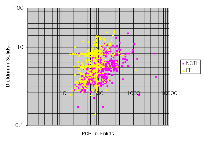
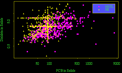
This exercise doesn't involve Pivot Tables but I included it because it is a very useful graph and you should know how to do it in Excel. Use different symbols and colours to distinguish between the two stations. Which station appears to have the more serious problem with detection limits?

Here is the same graph plotted in Splus. Which is easier for this example, Excel or Splus?
> plot(pcbsol, diesol, log = "xy", type = "n", xlab="PCB in Solids", ylab=
+ "Dieldrin in Solids")
> par(cex=.8)
> points(pcbsol[stn == "NOTL"], diesol[stn == "NOTL"], pch =15, col = 3)
> points(pcbsol[stn == "FE"], diesol[stn == "FE"], pch =17, col = 1)
> legend(1200, 25, c("NOTL", "FE"), marks = c(15, 17), col = c(3, 1),
+ background = 4)
The function dates() will convert the Julian dates stored in Excel to calendar dates, but you need to specify the origin (day zero) and the output format. I wrote a function my.dates() so I wouldn't have to write this out every time.
> my.dates
function(date)
{
        dates(date, origin = c(month = 12, day = 30, year = 1899), out.format
                 = "year-m-d")
}
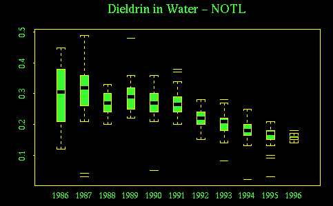
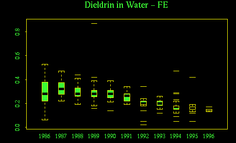
The following commands give boxplots of dieldrin in water, by year, for each station. Compare these plots to the annual averages plotted above. What are the advantages and disadvantages of the box plots here?
What will you get if you use "6, 7" or "1, 7" instead of "1, 4" in the substring() call? Why is as.character() necessary here?
> boxplot(split(diewat[stn == "FE"], substring(as.character(my.dates(date[
   stn == "FE"])), 1, 4)))
> title("Dieldrin in Water - FE")
> boxplot(split(diewat[stn == "NOTL"], substring(as.character(my.dates(date[
   stn == "NOTL"])), 1, 4)))
> title("Dieldrin in Water - NOTL")
