Choose one of the Case Studies prepared for the 1998 Annual Meeting of the Statistical Society of Canada, "Effects of effluent on the Kapuskasing River" or "Habitat availability for cutthroat trout in Dutch Creek, Alberta". Using S, apply EDA and submit a report showing what you have learned about the data. Be creative. Your report should include a variety of graphs.
Our discussion of the fish growth data raised several issues which I have investigated further.
I was interested to know how many observations there were at each "inage" and each "ygrow".
> attach(operc1)
> table(inage,ygrow)
   76 77 78 79 80 81 82 83 84 85 86 87 88 89 90 91 92 93 94 95
 1  0  1  0  1  0  2  2  3  5  8  7  9 13 21  7  4  1  0  0  0
 2  0  0  1  0  1  0  1  3  3  5  8  6  8 12 20  7  4  1  0  0
 3  0  0  1  2  0  3  2  5  9  9 15 19 17 25 22 43 22  4  1  0
 4  0  0  0  1  2  0  5  2  7  9  9 16 24 19 30 25 46 23  4  1
 5  0  0  0  0  1  2  0  5  2  7  9  9 16 24 20 30 26 46 23  3
 6  0  0  0  0  0  1  2  0  5  2  7  9  9 16 24 20 30 26 38 15
 7  0  0  0  0  0  0  1  2  0  5  2  7  9  9 16 24 20 29 22 22
 8  0  0  0  0  0  0  0  1  2  0  5  2  7  9  9 16 24 20 22 14
 9  0  0  0  0  0  0  0  0  1  2  0  5  2  7  9  9 16 24 14 14
10  0  0  0  0  0  0  0  0  0  1  2  0  5  2  7  9  9 16 17  7
11  0  0  0  0  0  0  0  0  0  0  1  2  0  5  2  7  9  9  9  8
12  0  0  0  0  0  0  0  0  0  0  0  1  2  0  5  1  7  9  2  3
13  0  0  0  0  0  0  0  0  0  0  0  0  1  2  0  5  2  7  7  0
14  0  0  0  0  0  0  0  0  0  0  0  0  0  1  2  0  5  2  4  2
15  0  0  0  0  0  0  0  0  0  0  0  0  0  0  1  2  0  5  1  1
16  0  0  0  0  0  0  0  0  0  0  0  0  0  0  0  1  2  0  4  0
17  0  0  0  0  0  0  0  0  0  0  0  0  0  0  0  0  1  2  0  2
18  0  0  0  0  0  0  0  0  0  0  0  0  0  0  0  0  0  1  2  0
>
Here is the ANOVA table from last week's notes, first as given by Splus, then expressed in a format you may be more familiar with.
Splus ANOVA Table:
> anova(operc.fit.1,test="F")
Analysis of Deviance Table

Gaussian model

Response: lingrow1

Terms added sequentially (first to last)
           Df Deviance Resid. Df Resid. Dev  F Value     Pr(F)
      NULL                  1636   1027.621
     inage 17 781.5660      1619    246.055 310.5557 0.0000000
     ygrow 18   3.7770      1601    242.278   1.4174 0.1133496
      site  2   2.9352      1599    239.343   9.9135 0.0000527
inage:site 32   7.3652      1567    231.978   1.5547 0.0251957
>
Reorganized ANOVA table:
        SV   DF         SS        MS         F          P

     inage   17   781.5660   45.9745  310.5557  0.0000000
     ygrow   18     3.7770    0.2098    1.4174  0.1133496
      site    2     2.9352    1.4676    9.9135  0.0000527
inage:site   32     7.3652    0.2302    1.5547  0.0251957
  residual 1567   231.978     0.1480

     TOTAL 1636  1027.621
Conclusions:
There is evidence that the mean log growth increments vary with site and with increment age, and that the effect of increment age is different at different sites.
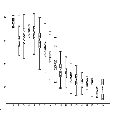
The following notched box plot shows how log growth increment varies with increment age, all sites combined. What do the notches show? Can you plot this separately for each site?
> attach(operc1)
> boxplot(split(lingrow1, inage), notch = T)

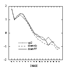
The graph below (created as a "Category Plot" in Systat) plots the mean log growth increment against increment age, separately for each of the three sites. Most of the difference between sites seems to be at the older ages. Is there an anomaly at increment age 1? Is there something odd happening at increment age 14, or can the kinks be explained by small sample sizes?
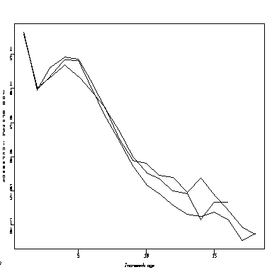
Here is the same graph created in Splus. It needs a legend. The lines all appear solid here but may be differentiated by dots and dashes on other graphics devices. In the code below, split produces a list of vectors and sapply applies the mean function to each one to return a vector of means, one for each of the 18 increment ages.
> attach(operc1)
> meanff <- sapply(split(lingrow1[site=="downff"],inage[site=="downff"]),mean)
> meantb <- sapply(split(lingrow1[site=="downtb"],inage[site=="downtb"]),mean)
> meanup <- sapply(split(lingrow1[site=="up2"],inage[site=="up2"]),mean)
> matplot(c(1:18), matrix(c(meanff, meantb, meanup), ncol = 3), type = "l",
xlab  = "increment age", ylab = "log growth increment")
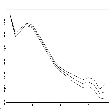
We might also consider how precisely the lines in the plot are estimated. For simplicity, I combined all three sites, so the graph below is a lot like the notched box plot above. I computed a 95% confidence interval for each mean, and connected all the lower bounds, means, and upper bounds by lines.
> attach(operc1)
> meanall <- sapply(split(lingrow1, inage), mean)
> varall <- sapply(split(lingrow1, inage), var)
> nall <- sapply(split(lingrow1, inage), length)
> meanall.lb <- meanall - qnorm(0.975) * sqrt(varall/nall)
> meanall.ub <- meanall + qnorm(0.975) * sqrt(varall/nall)
> matplot(c(1:18),matrix(c(meanall.lb,meanall,meanall.ub), ncol=3),type="l")
