
[Marks are indicated in red. Full marks = 95]
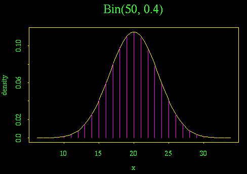
A. It is surprisingly difficult to put both graphs on the same scale, with bars for the binomial and a line for the normal, unless you use a system like Splus that allows user programming.

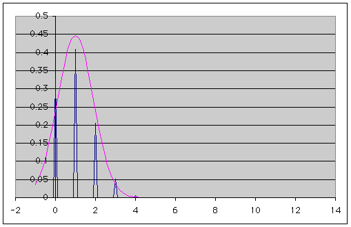
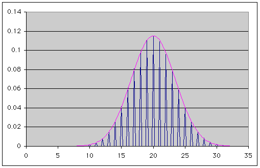
Here is the best I could do in Excel. There is a quirk in Excel: if you give a non-integer x it will compute the binomial at the next smaller integer. If you compute the grid by incrementing, it is possible that 3, for example, will come out as 2.999... and the binomial will be computed at 2 instead of 3. I worked around this by using A3 =ROUND(A2+$E$2,4) to round to 4 decimal places as I incremented the grid (using the increment stored in E2), and
B3 =IF(INT(A3)=A3, BINOMDIST(A3,$F$2,$G$2,FALSE), 0)
to compute the binomial only at integer values of the grid, returning 0 elsewhere. In my spreadsheet, F2 holds n and G2 holds p. I then displayed the distributions on a multiple-line X-Y chart. The binomial probabilities show as spikes. I should have labelled the axes but I didn't.
MINITAB is easier to use because you can define one grid for the binomial and another for the normal, and put both on the same plot with the "multiple plot" option. However, as far as I could see, both have to be the same type of graph. I couldn't use "Project" to give vertical bars for the binomial at the same time as "Connect" to give a smooth curve for the normal, so I used "Symbol" for both, with a large + for the binomial and a small circle for the normal.
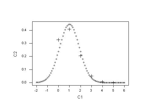
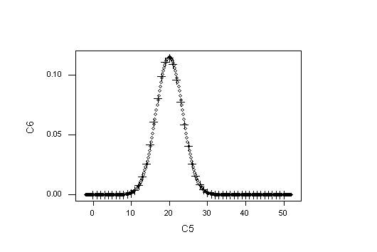
It is evident that Bin(50, 0.4) is very close to the approximating normal, while Bin(5, 0.2) isn't: there are too few probabilities and too much skewness.
A more useful display, much simpler to draw, but not required for the assignment, is a multiple bar chart comparing the binomial probability at x with the approximating normal integrated from x-0.5 to x+0.5, for x = 0, 1, ..., n. In Excel, these are calculated as BINOMDIST(A2,$D$2,$E$2,FALSE) and NORMDIST(A2+0.5,$F$2,$G$2,TRUE) - NORMDIST(A2-0.5,$F$2,$G$2,TRUE), respectively. In my spreadsheet, D2 holds n, E2 holds p, F2 holds np, and G2 holds sqrt(npq). The resulting graphs are shown below. Note that the integer grid values are used as X-axis labels.
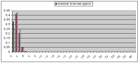
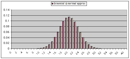
[2 graphs at 6 marks each = 12 marks]
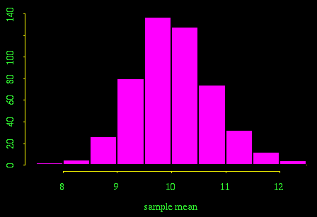
B. We study the sampling distribution of x_bar empirically by looking at the column of 500 sample means. If the data in each row are distributed IN(10, 2.5), the theory gives that x_bar will be distributed N(10, 0.125). The histogram of x_bar values is acceptably close to normality and the mean of the column, 10.033, is close to the theoretical value of 10. However, the variance of the column, 0.522, is much larger than the theoretical value of 0.125. This suggests that the data in each row are not independent.
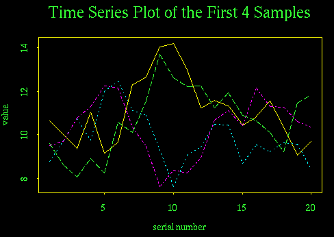
In applied work, we will have only one sample (i.e. one row in this exercise), so any test of the assumptions will have to work on a single row. I have looked at the first four rows, just to confirm that we will get similar results regardless of which row we examine.
The first graph, a time series plot, gives a strong indication of positive serial correlation: the time series fluctuate slowly, it tends to stay where it is rather than fluctuate back and forth across the mean.
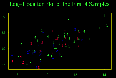
The lag-1 scatter plot also indicates positive correlation. In this plot, numbers 1 through 4 indicate which row is being plotted but the pattern is consistent for all four rows.
We can examine the normality of data in a given row with a stem and leaf plot or histogram, but we know that 20 observations are not enough to show the shape of the distribution clearly. Here are stem and leaf plots for the first four rows. The most we can say is that with such small samples, there is no evidence to reject the assumption of normality for any sample.
N = 20   Median = 10.91939
Quartiles = 9.85324, 11.94732

Decimal point is at the colon

    9 : 12477
   10 : 03468
   11 : 02366
   12 : 36
   13 : 0
   14 : 02


N = 20   Median = 9.59266
Quartiles = 9.12858, 10.60622

Decimal point is at the colon

    7 : 6
    8 : 478
    9 : 123456678
   10 : 5579
   11 : 1
   12 : 05


N = 20   Median = 10.51061
Quartiles = 9.49009, 11.27835

Decimal point is at the colon

    7 : 6
    8 : 249
    9 : 557
   10 : 444678
   11 : 1333
   12 : 122


N = 20   Median = 10.7592
Quartiles = 9.39865, 11.87723

Decimal point is at the colon

    8 : 0369
    9 : 26
   10 : 11669
   11 : 24589
   12 : 226
   13 : 7
We couldn't do the following if we had only one sample, but it is interesting to see how clearly normality shows when we combine the data from four rows to give a sample of 80 observations. Not required for the assignment.
N = 80   Median = 10.4666
Quartiles = 9.44732, 11.38662

Decimal point is at the colon

    7 : 66
    8 : 02344
    8 : 67899
    9 : 11222344
    9 : 55566677778
   10 : 01134444
   10 : 556666778899
   11 : 0112233334
   11 : 56689
   12 : 0122223
   12 : 566
   13 : 0
   13 : 7
   14 : 02
[8] for histogram, mean and variance of the sample mean.
[12] for histogram or stem and leaf, lag-1 plot and time series plot of at least one row.
[4] for conclusions.
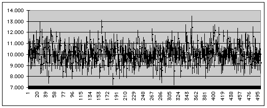
C. Here are the confidence intervals for the mean from the first 4 samples, and a graph showing the confidence intervals for all 500 samples. The confidence intervals use the two-sided 5% critical value for the t distribution on 19 degrees of freedom, t0.025,19 = 2.093. The graph is an Excel "High-Low-Close" stock chart, and is not required for the assignment. The upper limit is in column AA, the lower limit in column AB of my spreadsheet. The "miss" column is computed as IF(OR(AB2>10,AA2<10), 1, 0) and summing that column gives the number of intervals (in this case 183) that miss the true mean. The observed confidence level is therefore 100*(500 - 183)/500 = 63.4%, much less than the nominal level of 95%. The t-distribution confidence interval formula assumes that the variance of the sample mean is s2/n. In this exercise the intervals are too narrow and miss the true mean too often because, as was shown in B, there is positive serial correlation within each sample and hence the variance of the sample mean is actually greater than s2/n.
|
upper |
lower |
mean |
miss |
|
11.810 |
10.396 |
11.103 |
1 |
|
10.398 |
9.286 |
9.842 |
0 |
|
10.946 |
9.708 |
10.327 |
0 |
|
11.413 |
9.952 |
10.683 |
0 |
[10] for doing the confidence intervals and getting the observed confidence level.
[4] for conclusions.
D. Problems and data sets are taken from Montgomery & Runger, Applied Statistics and Probability for Engineers, 2nd edition, Wiley.
(a) X ~ Bin(n = 50, p = 0.1)
(b) P(X<=2) = P(X=0) + P(X=1) + P(X=2) = 0.00515 + 0.02863 + 0.07794 = 0.11173
(c) P(X>=49) = P(X=49) + P(X=50) = 4.5E-48 + 1E-50 = 4.5E-48
(a) X ~ Bin(20, 0.01), problem suspected if X > m + 3s = .2 + 3sqrt(0.198) = 1.53
Hence P(problem suspected) = P(X>1) = 1 - P(X=0) - P(X=1) = 1 - 0.81791 - 0.16523 = 0.01686
(b) Now X ~ Bin(20, 0.04), so P(X>1) = 1 - 0.44200 - 0.36834 = 0.18966
(c) Let Y be the number of times X>1 in the next 5 samples of 20; hence, from (b), Y ~ Bin(5, 0.18966) and so P(Y>=1) = 1 - P(Y=0) = 1 - (1 - 0.18966)5 = 0.65059
(a) Let X be fill volume; given that X ~ N(12.4, 0.12). P(X<12) = PHI((12-12.4)/0.1) = PHI(-4) = 0, where PHI() denotes the standard normal probability integral.
(b) P(scrapped) = P(X<12.1) + P(X>12.6) = PHI(-3) + 1 - PHI(2) = 0.00135 + 0.02275 = 0.02410
(c) Use z0.005 = 2.576 to give the limits m +/- z0.005s = 12.4 +/- 0.2576 = (12.14, 12.66)
(a) Let X be the lifetime; given that X ~ exp(l), where l = 1/m = 1/400 = 0.0025.
Hence P(X<100) = 1 - e-100(0.0025) = 0.2212
(b) P(X>500) = 1 - P(X<500) = 1 - e-500(0.0025) = 0.2865
(c) Since exponential failure time has no memory, the chance of failure in the next 100 hours is independent of how long the assembly has already lasted, and the result is the same as in (a).
Given: m1 = 75, s1 = 8, n1 = 16 and m2 = 70, s2 = 12, n2 = 9. Data normal.
Hence X_bar1 - X_bar2 ~ N(75-70, 64/16 + 144/9) = N(5, 20) is the sampling distribution.
P( X_bar1 - X_bar2 > 4) = 1 - PHI((4-5)/sqrt(20)) = 1 - PHI(-0.2236) = 0.5885
Given: mh = 60, sh = 4, nh = 16 and ml = 55, sl = 4, nl = 16. Data may not be normal, so assume that the central limit theorem applies.
Hence X_barh - X_barl ~ AN(60-55, 16/16 + 16/16) = AN(5, 2) is the sampling distribution.
P( X_barh - X_barl >= 2) = 1 - PHI((2-5)/sqrt(2)) = PHI(2.121) = 0.9831
Given: m1 = 100, s1 = 1.5, n1 = 25 and m2 = 105, s2 = 2.0, n2 = 30. Data normal.
Hence X_bar1 - X_bar2 ~ N(100-105, 2.25/25 + 4/30) = N(-5, 0.22333) is the sampling distribution.
(a) Give a histogram or stem and leaf plot of the data; seems to be normal, but the sample is really too small to tell. Statistics: n = 15, x_bar = 8.234, s = 0.02530.
N = 15   Median = 8.24
Quartiles = 8.21, 8.25

Decimal point is 2 places to the left of the colon

   819 : 0
   820 : 00
   821 : 0
   822 :
   823 : 000
   824 : 000
   825 : 00
   826 : 00
   827 :
   828 : 0
(b) Do a right-sided t-test on n-1 = 14 degrees of freedom; t0.05,14 = 1.761 for a 5% test.
t0 = (8.234 - 8.20)/(0.02530/sqrt(15)) = 5.205
Since t0 > t0.05,14 and this is a right-tail test, we reject the hypothesis at the 5% level of significance.
(c) From the table in the text, t0.0005,14 = 4.14 < t0, so the most we can say is that P-value < 0.0005.
(d) t0.025,14 = 2.145, so the 95% two-sided confidence interval is 8.234 +/- 0.014 = (8.220, 8.248).