The discussion of a graph should point out any particularly interesting features that say something about the process being studied. A general description of the graph isn't necessary, it would be redundant when you can look at the graph.
[Marks are indicated in red. Full marks = 90]
(a) Time series plot [5 for plot, 8 for discussion]
Note: linear upward trend over the time period; seasonality (lowest in winter); mid-summer dip in 1966 and later years; lower than expected in June and July of 1968. I think the pound had just devalued; was there any other crisis then that may have discouraged domestic air travel in the UK?

(b) Stem-and-leaf plot [5 for plot, 4 for discussion]
On its own, the stem-and-leaf plot suggests a well behaved, nearly-normal variation in monthly passenger miles. However, the time series plot shows that most of the variation is due to trend and seasonality. If we could model trend and seasonality, the variation about that model would be very much less than the total variation shown here.
N = 84   Median = 10.6415
Quartiles = 8.8855, 12.234

Decimal point is at the colon

    6 : 8
    7 : 347788899
    8 : 123345678899
    9 : 1133456699
   10 : 0123344566678889999
   11 : 023446666
   12 : 2222344588
   13 : 01346778
   14 : 1189
   15 : 1
16 : 2(a) [5]
Sample mean: x_bar = 65.08333
Stem-and-leaf plot (useful but not required). With only 6 values here, a stem-and-leaf-plot is more appropriate than a box plot.
N = 6   Median = 65.2
Quartiles = 64, 65.8

Decimal point is at the colon

   63 : 2
   64 : 0
   65 : 138
   66 :
   67 : 1
If "close" is defined relative to the total spread in the observed values, both the mean and the median are close to the "desirable" or "target" value of 65.0 g/l. Intuitively, while there is no reason to reject the hypothesis that the mean concentration is 65.0, the results would also seem to be consistent with a mean concentration anywhere from about 64 to 66. (Later in the course we will learn how to formalise statements like this, as "confidence intervals".) Hence if we only need to know whether we are within 1 g/l of the target value, these 6 measurements will be enough. But if we have to know more precisely than that, we will either need a more precise assay or many more measurements than this.
(b) [2]
Sample variance: s2 = 1.869667, s = 1.367358
(c) [5]
Use your knowledge of analytical chemistry to say something useful about the sources of variation in this experiment. What could the operator do to reduce the experimental error?
(a) Time series plot [5 for plot, 8 for discussion]
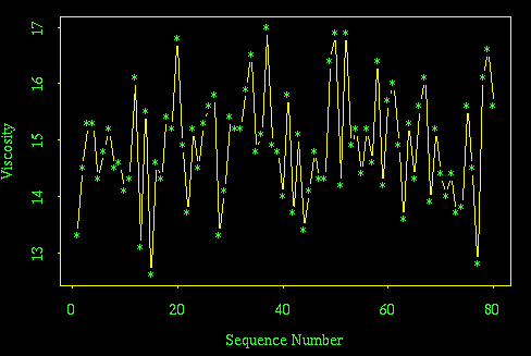
If there is a trend or a change after the 40th observation, the effect is very small relative to the noise in the series and hence can't be detected. Note that there is no way to tell whether the noise is due to variation in the process, measurement error, or both.
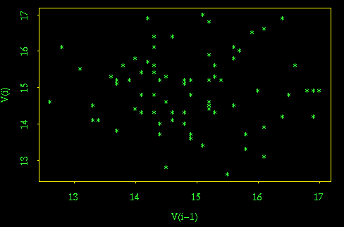
Lag 1 scatter plot (useful but not required) [5-mark bonus]
The lag-1 scatterplot shows no autocorrelation, supporting the claim that the variation in the series is pure noise, and if there is correlation, trend, or a change-point, the effect is very small compared to the random noise in the system.
(b) Boxplot to compare the first 40 observations with the second 40 [5]
The boxplots for the first 40 and second 40 observations appear to be very similar.

(c) [5]
First 40 observations: x_bar = 14.875, s2 = 0.899359
Second 40 observations: x_bar = 14.9225, s2 = 1.046404
These values seem to be very close, but we won't have formal methods for testing equality until later in the course.
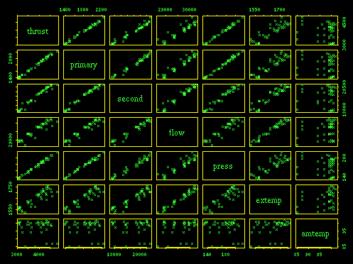
Scatterplot Matrix [5 for plot, 8 for discussion]
Thrust appears to be strongly correlated with everything except ambient temperature. Secondary rotation and pressure are both strongly correlated with primary rotation, so they may not be needed in a model that includes primary rotation.
Looking at the variables this way, in pairs, suggests that ambient temperature is of no use in predicting thrust, but this is an erroneous conclusion and illustrates the danger of looking at variables in pairs rather than multivariably. Brushing the 5 points at the lowest ambient temperature shows that lowered ambient temperature shifts the thrust vs secondary rotation, thrust vs flow, and thrust vs exhaust temperature relationships upwards, so ambient temperature does affect thrust but not in a way that is revealed in the thrust vs ambient temperature scatter plot.
Histograms of the variables one at a time [5 for plots, 5 for discussion]
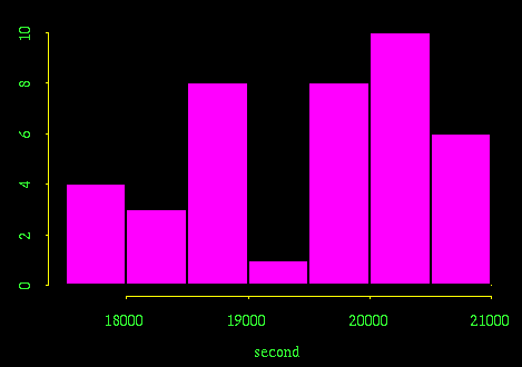
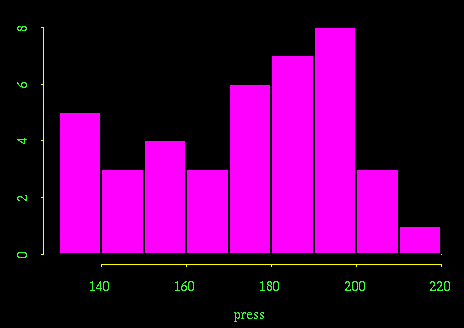
None of the histograms appear to come from normal distributions. In fact, some distributions, secondary rotation and flow in particular, suggest that this was an attempt at a designed experiment with certain variables set as close as they could be to 4 different levels.
If I were designing a follow up experiment, I would consider trials spread more uniformly over a wider range of ambient temperatures.





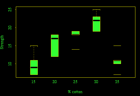
Boxplot to show strength as a function of % cotton [5 for plot, 5 for discussion]
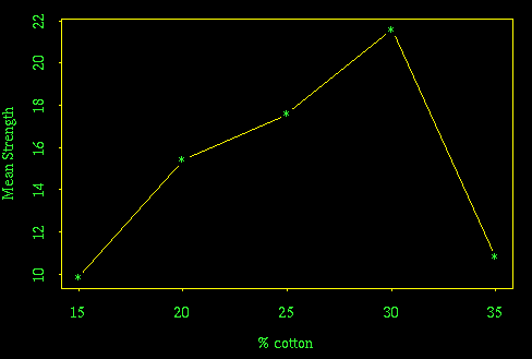
There is good evidence here that 30% cotton makes the strongest thread. More tests should be done around this level, to determine the optimum more precisely and to make sure that the low strength observed at 35% cotton is correct and not an experimental artifact.
Plot of mean strength as a function of % cotton
This plot was suggested in the text but is not required. Since the % cotton levels are evenly spaced, a scatterplot of mean strength against % cotton reveals essentially the same shape as the boxplots.
