
The boxplot of battery life by ambient temperature shows that battery life is longer and less variable at low temperature. This is probably something known to the experimenter, however, and the real interest is in the plate materials.

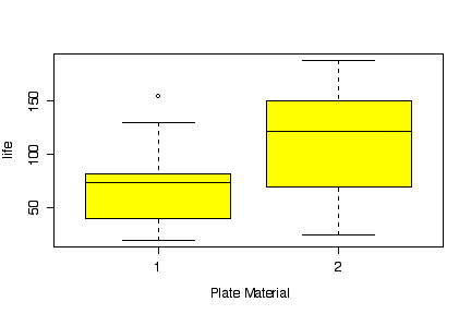
The boxplot of battery life by plate material shows that material 2 gives a somewhat longer life, but there is a lot of overlap.
Whichever way you do the interaction plot, it is clear that at low or high temperatures plate material 2 gives a longer average life, but at medium temperature it makes no difference which of the two plate materials is used. This means that there is an interaction between ambient temperature and plate material, as the difference between the two materials is not found at all ambient temperatures. The box plots, looking at the factors one at a time, cannot show the interaction.


Since the data were given on the question paper with comma
separators, I found it faster to paste them directly into a
data.frame command in R, rather than retype the data in
Excel, save to text, and import into R. I used rep to
create the factor columns. Note that by specifying
levels=c("low","medium","high") in factor,
the levels will appear in that order in all the plots instead of
being sorted alphabetically, which would have ordered them ("high",
"low", "medium").
I used the R function interaction.plot; you could
instead use my function interactplot. You could even do
the plots partly or entirely by hand but that would take much more
time.
> plate <- data.frame(life=c(130,  74, 155,     34,  80,  40,     20,  82,  70,
    150, 159, 188,     25,  58,  70,    136, 106, 122),
    atemp=factor(rep(rep(c("low","medium","high"),c(3,3,3)),2),
     levels=c("low","medium","high")),
    mater=factor(rep(1:2,c(9,9))))
> plate
   life  atemp mater
1   130    low     1
2    74    low     1
3   155    low     1
4    34 medium     1
5    80 medium     1
6    40 medium     1
7    20   high     1
8    82   high     1
9    70   high     1
10  150    low     2
11  159    low     2
12  188    low     2
13   25 medium     2
14   58 medium     2
15   70 medium     2
16  136   high     2
17  106   high     2
18  122   high     2
> boxplot(life~atemp, data=plate, col="yellow",
    xlab="Ambient Temperature", ylab="life")
> boxplot(life~mater, data=plate, col="yellow",
    xlab="Plate Material", ylab="life")
> interaction.plot(plate$atemp, plate$mater, plate$life)
> interaction.plot(plate$mater, plate$atemp, plate$life)
Comparative box plots and conclusions: 6
marks
One or both interaction plots (created by any means) and
conclusions: 6 marks
Temperatures in the correct order from low to high (achieved by
any means): 1 mark
Quality of presentation (appearance, clarity, writing): 2 marks
Inappropriate plots: up to 4 marks
off
The interest here seems to be in comparing the different measures of maximum annual precipitation, ranging from 5-minute (more sensitive to sudden extreme rainfall) to 24-hour (sensitive to long periods of rain).
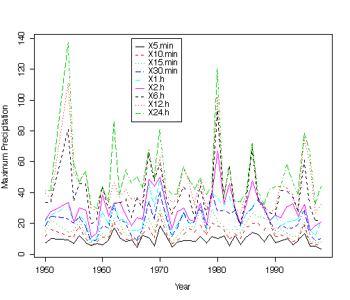
I first compared them as time series, plotting all 9 series on one graph. The series lie consistently one above the other, from 5-minute to 24-hour, with the variability increasing in that order. The top few series are similar to each other in terms of where the peaks lie, and the bottom few series are also similar to each other.
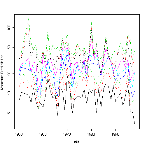
On a log scale, the series appear more equally variable.
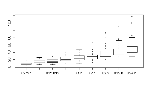
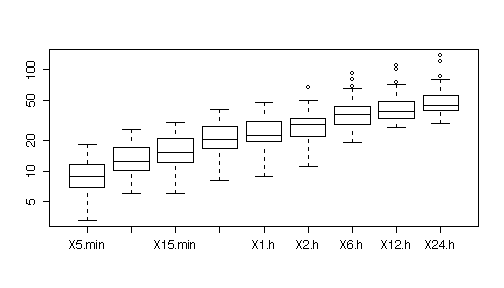
A box plot by series (collapsing all years) shows how the mean precipitation and the spread increases steadily from the 5-minute series to the 24-hour series.
On a log scale, the series are more equal in spread.
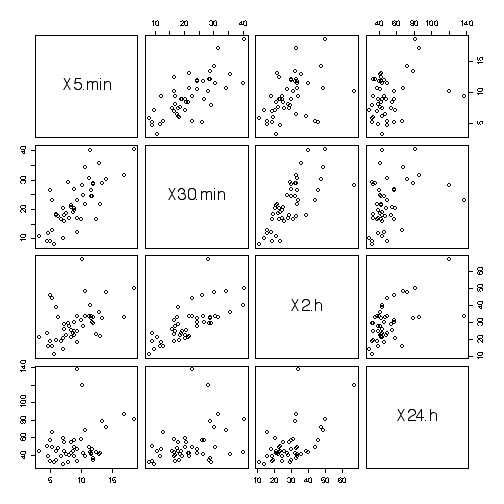
The scatterplot matrix shows that series one step apart (e.g. 5-minute and 10-minute, 10-minute and 15-minute, etc.) are show a strong linear relationship, series two steps apart (e.g. 5-minute and 15-minute, etc.) are less strongly related, and so one, until series 4 or more steps apart are virtually independent. This means that if we did not want to maintain records of all 9 series it might be enough to have every third one or fourth one, perhaps 5-minute, 30-minute, 2-hour and 24-hour.

Picking just these series gives a scatterplot matrix that is easier to read.
The original column names "5 min", etc., are not valid column
names in R because they begin with a number and include a space. You
could change them manually in Excel. Here, I took the easier route of
letting R change them but I had to save the file in tab-delimited
format and explicitly specify the tab separator in
read.table because the default separator is any white
space.
> maxyrprecip <- read.table("maxyrprecip.txt", head=T, sep="\t")
> maxyrprecip[1:10,]
   Year X5.min X10.min X15.min X30.min X1.h X2.h X6.h X12.h X24.h
1  1950    7.6    11.7    15.2    18.5 21.3 22.4 33.8  39.4  41.4
2  1951   10.4    16.0    21.8    24.6 25.9 27.7 34.3  36.1  41.7
3  1954    9.4    11.7    14.5    22.9 31.2 33.8 80.8 110.7 137.4
4  1955    7.1    11.7    15.7    20.3 20.6 20.6 35.1  52.8  58.7
5  1956   11.9    17.8    21.1    24.4 24.6 30.0 46.0  46.5  46.7
6  1957    7.4    10.2    13.0    17.8 21.3 28.7 46.0  53.8  54.1
7  1958    5.8     6.1     6.1     8.1  8.9 11.2 20.3  30.0  32.3
8  1959    7.1     8.4     8.6     9.9 10.4 14.0 22.4  27.9  29.5
9  1960    6.1    11.2    13.5    17.8 27.2 38.6 44.0  44.0  44.0
10 1961    9.4    10.7    11.2    17.0 19.6 24.6 30.0  33.5  33.5
> matplot(maxyrprecip$Year,maxyrprecip[,-1], type="l", xlab="Year",
   ylab="Maximum Precipitation")
> legend(1965,140,names(maxyrprecip)[-1], lty=1:5, col=1:6)
> matplot(maxyrprecip$Year,maxyrprecip[,-1], type="l", xlab="Year",
   ylab="Maximum Precipitation", log="y")
> boxplot(maxyrprecip[,-1])
> boxplot(maxyrprecip[,-1], log="y")
> pairs(maxyrprecip[,-1])
> pairs(maxyrprecip[,c(2,5,7,10)])
Pairs plot and interpretation: 8
marks
Any appropriate analysis of the time series: 8 marks
Anything else (box plots, histograms or other univariate
analyses): 2 marks
Quality of presentation (appearance, clarity, writing): 2 marks
Inappropriate plots: up to 4 marks
off