
I have put the R code before each graph to make it easier to see exactly how I created it. If you were writing a formal report, the R code would be omitted or put in an Appendix, so you are not required to show it for this assignment. Marks are indicated in red, including 10 marks for the quality of your presentation.
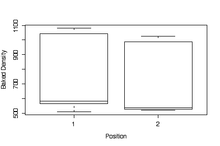
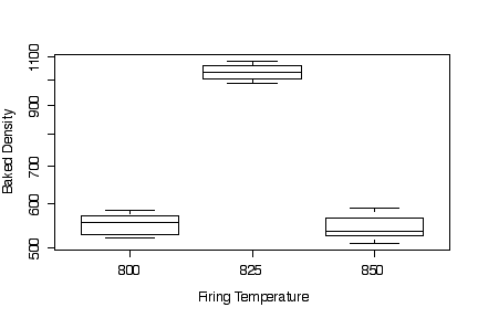
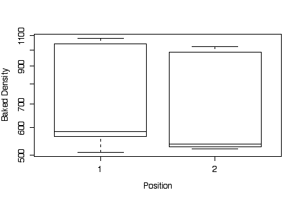
The box plots show that firing temperature makes a big difference in baked density, and position makes very little difference. The highest density was achieved at 825'. The box plots by position are very wide because they include the variation due to temperature, so they are not useful.
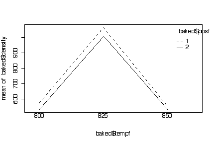
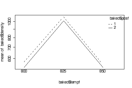
The interaction plots show clearly that position 1 gives a slightly higher density that position 2, but this effect is small compared to the effect of temperature over the range of positions and temperatures studied. Because the lines within each interaction plot are close to parallel, we conclude that there is no interaction, that is, the change in mean density due to temperature is the same at each position and the change due to position is the same at each temperature.
Because the baked densities are all about the same order of magnitude, converting to a log scale was a waste of time, the log scale is almost linear and the log-scale plots look almost exactly the same as the plots in original units.
I used the R function interaction.plot() but I could
have used my interactplot() function instead. Hand-drawn
or partly hand-drawn interaction plots will be acceptable.
> baked$tempf <- as.factor(baked$temp)
> baked$posf <- as.factor(baked$pos)
> boxplot(density~temp, baked, xlab="Firing Temperature", ylab="Baked Density")
> boxplot(density~pos, baked, xlab="Position", ylab="Baked Density")
> interaction.plot(baked$tempf, baked$posf, baked$density)
> interaction.plot(baked$posf, baked$tempf, baked$density)
> boxplot(density~temp, baked, xlab="Firing Temperature", ylab="Baked Density", log="y")
> boxplot(density~pos, baked, xlab="Position", ylab="Baked Density", log="y")
> interaction.plot(baked$tempf, baked$posf, baked$density, log="y")
> interaction.plot(baked$posf, baked$tempf, baked$density, log="y")
Plots with baked density in original units:


Plots with baked density on a log scale:

From the box plots, it is clear that Headlamp Glass is easy to distinguish from Window Float Glass or Vehicle Window Glass: it is much higher in Ba (most fragments of other types have no Ba), and somewhat higher in Na and Al. It is much lower in Mg and usually lower in Fe.
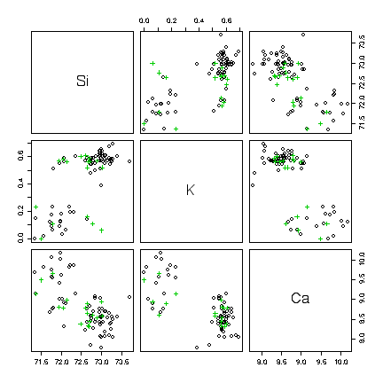
Distinguishing between Window Float and Vehicle Window Glass is much harder. In the box plots, they are always very similar. It may be worth exploring the scatterplot matrix to see if variables two at a time are more informative. After eliminating all the types except WinF and Veh and zooming in on some plots in the scatterplot matrix, we see that fragments high in Si, high in K and low in Ca are most likely WinF rather than Veh, but in other cases the two can't be distinguished. Other combinations of 3 variables may be equally effective.
> library(MASS)
> data(fgl)
> dim(fgl)
[1] 214  10
> names(fgl)
 [1] "RI"   "Na"   "Mg"   "Al"   "Si"   "K"    "Ca"   "Ba"   "Fe"   "type"
> boxplot(RI~type,fgl,ylab="RI")
> boxplot(Na~type,fgl,ylab="Na")
> boxplot(Mg~type,fgl,ylab="Mg")
> boxplot(Al~type,fgl,ylab="Al")
> boxplot(Si~type,fgl,ylab="Si")
> boxplot(K~type,fgl,ylab="K")
> boxplot(Ca~type,fgl,ylab="Ca")
> boxplot(Ba~type,fgl,ylab="Ba")
> boxplot(Fe~type,fgl,ylab="Fe")
|
|
|
|
|
|
|
|
|
|
|
|
|
|
|
"WinF" (black), "WinNF" (red), "Veh" (green), "Con" (blue), "Tabl" (cyan), "Head" (magenta).

> fglvw<-fgl[fgl$type=="WinF"|fgl$type=="Veh",]
> pairs(fglvw[,5:7], col=as.numeric(fglvw$type), pch=as.numeric(fglvw$type))
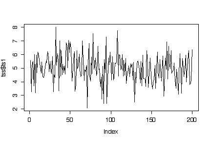
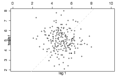
First series: The two lag plots show a circular cloud of points, suggesting that the observations are not autocorrelated. The time series plot oscillates up and down randomly, with no indication of trend or periodicity. The histogram looks like a normal distribution. The sample mean is 4.99, the sample variance 1.10. This suggests that the series is a sample of independent normal observations with mean = 5 and variance = 1.
> plot(tss$ts1, type="l")
> lag.plot(tss$ts1,set.lag=1)
> lag.plot(tss$ts1,set.lag=2)
> hist(tss$ts1)
> mean(tss$ts1)
[1] 4.990151
> var(tss$ts1)
[1] 1.096671


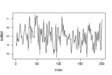
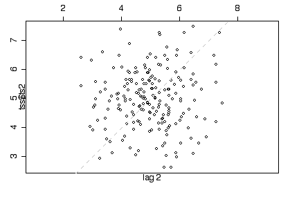
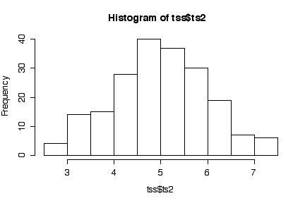
Second series: The lag 1 plot shows an elliptical cloud of points along the diagonal, suggesting that consecutive observations are autocorrelated. The lag 2 plot is a circular cloud, suggesting that autocorrelation does not go beyond lag 1. Consistent with this impression, the time series plot moves randomly without trend or seasonality but, compared to ts1, tends to stay up once up and stay down once down. The histogram looks like a normal distribution. The sample mean is 4.99, the sample variance 1.02. This suggests that the series is a sample of lag 1 dependent normal observations with mean = 5 and variance = 1.
> plot(tss$ts2, type="l")
> lag.plot(tss$ts2,set.lag=1)
> lag.plot(tss$ts2,set.lag=2)
> hist(tss$ts2)
> mean(tss$ts2)
[1] 4.988864
> var(tss$ts2)
[1] 1.017119
> boxplot(tss)

Give a maximum of 10 marks for a good presentation: clearly worded, neatly laid out on the page, easy to read and understand, free of errors in spelling or grammar.