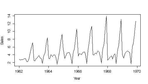
 > plot(xyears,chmp$sales,type="l",xlab="Year",ylab="Sales",log="y")

I have put the R code before each graph to make it easier to see exactly how I created it. If you were writing a formal report, the R code would be omitted or put in an Appendix, so you are not required to show it for this assignment. Marks are indicated in red. Full marks = 60.
The time series plot shows an annual pattern, with sales peaking in November and December, dropping in January, rising a bit and holding steady from February to July before hitting an extreme low in August, then increasing steadily through to December. While the November-December peak rose steadily from 1962 to 1968, most other features of the plot remained relatively constant.
Plotting on a log scale diminished the impact of the November-December peak and exaggerated the year-to-year variation in the February-July plateau.
> xyears <- seq(1962,1969+(11/12),length=96) > plot(xyears,chmp$sales,type="l",xlab="Year",ylab="Sales")> plot(xyears,chmp$sales,type="l",xlab="Year",ylab="Sales",log="y")
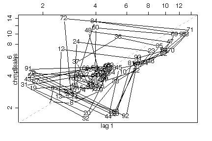
A lag plots is only useful for showing autocorrelation if trend and seasonal effects have been removed, which is not the case here. It does, however, show that there are 3 months of increasing sales (September-December) followed by a sharp drop, then 9 months of relatively constant sales. If you look at the numbers on the chart you can even see the height of the December peak increasing. The log lag plot gives the same information, but also shows the sudden drop each August.
> library(ts) > lag.plot(chmp$sales)> lag.plot(chmp$sales,log="xy")
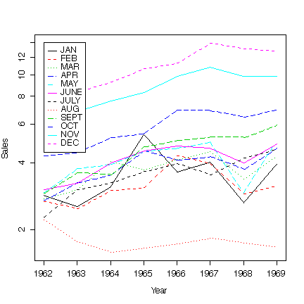
Separating the data by month and plotting 12 separate time series is perhaps the most informative plot we can do, and clarifies all the points made above. Again, on a log scale, the difference between the low-sales months is brought out while the importance of the December peak is diminished.
> year <- chmp$month[1:12] > matplot(1962:1969,as.data.frame(split(chmp$sales,chmp$month)[year]),type="l",ylab="Sales",xlab="Year") > legend(1962,14,as.character(year),col=1:6,lty=1:5)> matplot(1962:1969,as.data.frame(split(chmp$sales,chmp$month)[year]),type="l",ylab="Sales",xlab="Year",log="y") > legend(1962,14,as.character(year),col=1:6,lty=1:5)
The next plot treats annual changes as random variation rather than trend but lets us compare months easily. Note that July sales are now seen to be slightly lower than June but, of course, not as low as August.
> boxplot(split(chmp$sales,chmp$month)[year],ylab="Sales",main="All Years Combined")> boxplot(split(chmp$sales,chmp$month)[year],ylab="Sales",main="All Years Combined",log="y")

You can project 1970 sales any reasonable way. Note that the increasing trend seems to level off after about 1965 for all months of the year, so fitting the trend might be a very poor way to project as it would likely overestimate next year's sales.
Here are monthly and total projections computed three different ways: mean over all years, mean over last 4 years, mean over last 2 years. You could also use medians, but they would be the same as means if you took the last 2 years only. The average of the last two years seems to me to give the best projection.
> sapply(split(chmp$sales,chmp$month)[year],mean)
      JAN       FEB       MAR       APR       MAY      JUNE      JULY
 3.512750  3.193875  3.733875  3.854625  4.091375  4.135125  3.571375
      AUG      SEPT       OCT       NOV       DEC
 1.766000  4.528250  5.826750  8.610500 10.798375

> sum(sapply(split(chmp$sales,chmp$month)[year],mean))
[1] 57.62288

> sapply(split(chmp$sales[chmp$year>1965],chmp$month[chmp$year>1965])[year],mean)
     JAN      FEB      MAR      APR      MAY     JUNE     JULY      AUG
 3.55550  3.57750  4.08000  4.20325  4.38800  4.57250  4.08450  1.73525
    SEPT      OCT      NOV      DEC
 5.36050  6.80000 10.08850 12.74825

> sum(sapply(split(chmp$sales[chmp$year>1965],chmp$month[chmp$year>1965])[year],mean))
[1] 65.19375

> sapply(split(chmp$sales[chmp$year>1967],chmp$month[chmp$year>1967])[year],mean)
    JAN     FEB     MAR     APR     MAY    JUNE    JULY     AUG    SEPT
 3.2865  3.0305  3.8280  4.2080  3.9685  4.4300  4.4250  1.6985  5.5860
    OCT     NOV     DEC
 6.7025  9.8465 12.8730

> sum(sapply(split(chmp$sales[chmp$year>1967],chmp$month[chmp$year>1967])[year],mean))
[1] 63.883
In France, just about everyone goes on vacation in August. Paris is virtually shut down, and most small retail business close for the month. This makes it difficult to buy champagne. Furthermore, the wealthier citizens are likely to travel to other countries for their vacations and this might also reduce demand for champagne in August.
The first 30 days have a mean of 7.3 and standard deviation of 2.7, while the next 10 have a mean of 15.4 and a standard deviation of 3.0. This is visible on the time series plot. The change in mean is large compared to the standard deviation, suggesting that there was an increase in the number of nonconforming items after day 30. There is no suggestion of a trend.
The lag plot is difficult to interpret because of the shift in mean, but if you look at days 1 to 30 and 31 to 40 separately in the lag plot, there is no suggestion of autocorrelation within each period. Overall there appears to be autocorrelation because the series remains low for 30 days then high for 10 days.
> stem(springs) The decimal point is at the | 2 | 0 4 | 0000000 6 | 0000000000 8 | 0000000 10 | 000 12 | 00000 14 | 00 16 | 00 18 | 000 > mean(springs) [1] 9.325 > sqrt(var(springs)) [1] 4.485804 > mean(springs[1:30]) [1] 7.3 > sqrt(var(springs[1:30])) [1] 2.705677 > mean(springs[31:40]) [1] 15.4 > sqrt(var(springs[31:40])) [1] 2.988868 > > plot(springs,type="l",ylab="number nonconforming")> lag.plot(springs)
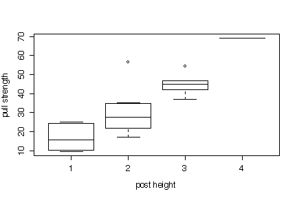
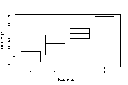
There is a strong linear correlation between wire length and pull strength; the other relationships are much weaker. The effects of post height and loop length show up much better on the comparative box plots than on the scatterplot matrix.
None of the variables appear to be normally distributed, but since some of them (post height, loop length, in particular) may be design variables set by the experimenter, that is not surprising.
We conclude that wire length affects pull strength directly. Die height, post height and loop length also affect pull strength, but less clearly. This analysis looks at the variables only one and two at a time; it would be worth doing a more complex analysis to look for interactions between the variables.
There is no suggestion that the observations are presented in temporal order, so time series plots and lag plots would be inappropriate.
> pairs(pull)> hist(pull$strength,col="yellow") > hist(pull$length,col="yellow") > hist(pull$dheight,col="yellow")
|
|
|
|

Method 2 has a lower median than Methods 1 or 3; Method 3 is less variable than Methods 1 or 2. There is considerable overlap, however, so graphical methods are not enough to give a definitive answer in this example.
Plotting on a log scale makes almost no difference at all in this example. That is because all the observed values are close in magnitude. A log transformation will be much more effective if, say, the observed values cover a range from units to hundreds.
> boxplot(split(fish$quality,fish$method),xlab="method",ylab="quality score")> boxplot(split(fish$quality,fish$method),xlab="method",ylab="quality score",log="y")
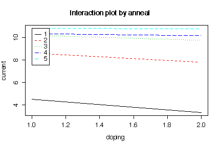
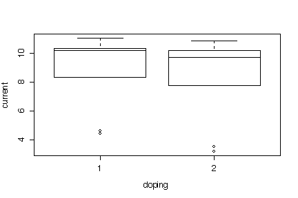
The box plots show very little difference in base current between the two dopings, relative to the error, but considerable difference between the five anneal conditions. Since much of the variation within each doping is due to the different anneal conditions, we have to use the interaction plots to study the two factors together.
The interaction plots show a strong effect for anneal condition and a weaker effect for doping. There is also some evidence of interaction, in that the difference between the two dopings is less at the higher levels of anneal condition (annealing at higher temperatures for shorter times).
> transistor
curr doping anneal
1 4.40 1 1
2 4.60 1 1
3 8.30 1 2
4 8.90 1 2
5 10.15 1 3
6 10.20 1 3
7 10.29 1 4
8 10.30 1 4
9 11.01 1 5
10 10.58 1 5
11 3.20 2 1
12 3.50 2 1
13 7.81 2 2
14 7.75 2 2
15 9.38 2 3
16 10.02 2 3
17 10.19 2 4
18 10.10 2 4
19 10.81 2 5
20 10.60 2 5
> boxplot(split(transistor$curr,transistor$doping),xlab="doping",ylab="current")
> boxplot(split(transistor$curr,transistor$anneal),xlab="anneal",ylab="current")
 > interactplot <-
function (y, facta, factb, xlab = deparse(substitute(factb)),
ylab = deparse(substitute(y)), main = paste("Interaction plot by",
deparse(substitute(facta))), ...)
{
values <- sapply(split(y, facta:factb), mean)
matplot(matrix(values, ncol = nlevels(facta)), type = "l",
xlab = xlab, ylab = ylab, ...)
title(main = main)
legend(1, max(values), levels(facta), lty = 1:nlevels(facta),
col = 1:nlevels(facta))
invisible()
}
> attach(transistor)
> interactplot(curr,doping,anneal,ylab="current")
> interactplot(curr,anneal,doping,ylab="current")

