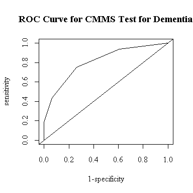
[Full Marks = 100]
|
cutoff |
sensitivity |
specificity |
1-specificity |
|
5 |
2/16 = 0.125 |
46/46 = 1 |
0 |
|
10 |
3/16 = 0.1875 |
46/46 = 1 |
0 |
|
15 |
7/16 = 0.4375 |
43/46 = 0.93478 |
0.06522 |
|
20 |
12/16 = 0.75 |
34/46 = 0.73913 |
0.26087 |
|
25 |
15/16 = 0.9375 |
18/46 = 0.39130 |
0.60870 |
|
30 |
16/16 = 1 |
0/46 = 0 |
1 |
As another way to determine an optimal cutoff, I modified plot.roc() to find the cutoff that gives the greatest lift, that is, the point where the ROC curve is as high as possible above the diagonal. The function draws the ROC curve and returns a list with the area under the curve, the cutoff, and the sensitivity and specificity at the cutoff.
I entered the data assuming that the CMMS score was at the mid-point within each range, so the "optimal" cutoff of 18 includes the whole range 16-20 and is the same as the cutoff of CMMS <= 20 in the table above. The table indicates that this is the only cutoff for which both sensitivity and specificity exceed 70%.
> plot.roc
function (sd, sdc)
{
    sall <- sort(c(sd, sdc))
    sens <- 0
    specc <- 0
    for (i in 1:length(sall)) {
        sens <- c(sens, mean(sd <= sall[i], na.rm = T))
        specc <- c(specc, mean(sdc <= sall[i], na.rm = T))
    }
    plot(specc, sens, xlim = c(0, 1), ylim = c(0, 1), type = "l",
        xlab = "1-specificity", ylab = "sensitivity")
    abline(0, 1)
    npoints <- length(sens)
    area <- sum(0.5 * (sens[-1] + sens[-npoints]) * (specc[-1] -
        specc[-npoints]))
    lift <- (sens - specc)[-1]
    cutoff <- sall[lift == max(lift)][1]
    sensopt <- sens[-1][lift == max(lift)][1]
    specopt <- 1 - specc[-1][lift == max(lift)][1]
    list(area = area, cutoff = cutoff, sensopt = sensopt, specopt = specopt)
}

> cmmsd <- c(rep(2.5,2),rep(8,1),rep(13,4),rep(18,5),rep(23,3),rep(28,1))
> cmmsnd <- c(rep(13,3),rep(18,9),rep(23,16),rep(28,18))
> plot.roc(cmmsd,cmmsnd)
$area
[1] 0.8091033

$cutoff
[1] 18

$sensopt
[1] 0.75

$specopt
[1] 0.7391304

The area under the curve is 80.9%. This means that if we had a demented subject and a non-demented subject, each chosen at random, and deemed the one with the lower CMMS score to be the demented subject (or made an equiprobable random decision in the case of a tie), we would have an 80.9% chance of identifying the demented subject correctly.
In all cases, there is one affected parent. Define the events: C = "Complete penetrance", R = "Reduced penetrance", Ai = ith offspring affected.
Given that P(C) = P(R) = 0.5, P( Ai | C ) = 0.5, P( Ai | R ) = 0.25, for all i.
The probability that both offspring are affected, given complete penetrance:
P( A1 A2 | C ) = P( A1 | C ) P( A2 | C ) = 0.25
The probability that both offspring are affected, given reduced penetrance:
P( A1 A2 | R ) = P( A1 | R ) P( A2 | R ) = 0.0625
The probability of complete penetrance in the family, given that both offspring are affected:
P( C | A1 A2 ) = P( A1 A2 | C ) P(C) / { P( A1 A2 | C ) P(C) + P( A1 A2 | R ) P(R) } = 0.8
The probability that a third child will be affected, given that the first two offspring are affected:
P( A3 | A1 A2 ) = P( A3 | C ) P( C | A1 A2 ) + P( A3 | R ) P( R | A1 A2 ) = 0.45
> plot.roc(lead$Iqf[lead$Hyperact!=0],lead$Iqf[lead$Hyperact==0])
$area
[1] 0.6974359

$cutoff
[1] 92

$sensopt
[1] 0.6666667

$specopt
[1] 0.6923077

> title(main="ROC for IQF test for Hyperactivity")
To determine the optimal cutoff, we could use the point of maximum lift of the ROC curve, which gives a cutoff of 92, as shown above. We could also use the formula from Exercise #3 which says that if the prevalence is 50% and if the score is distributed normally with equal variances in the two groups, the cutoff that minimises the total number of misclassifications is mid-way between the means. In R this can be computed as follows:
> sapply(split(lead$Iqf,lead$Hyperact!=0),mean)
   FALSE     TRUE
96.46154 88.17778
> mean(sapply(split(lead$Iqf,lead$Hyperact!=0),mean))
[1] 92.31966
confirming that a cutoff of 92 may be a good choice. In this study there are 45 hyperactive children and 39 non-hyperactive so the assumption that prevalence is 50% in the study population may be reasonable.
Any way of comparing the observed distribution with a normal curve will do here; the simplest way is to plot the histogram (as a probability) and superimpose a normal density function computed at the sample mean and variance. To save time while doing all 12 graphs, I wrote a function to draw the graph with a single call.
> histnorm
function (x, xlab = NULL, main = NULL)
{
    hist(x, prob = T, xlab = xlab, main = main)
    xbar <- mean(x)
    sd <- sqrt(var(x))
    xgr <- seq(xbar - 3 * sd, xbar + 3 * sd, length = 100)
    lines(xgr, dnorm(xgr, xbar, sd))
}

> histnorm(valid$sfff,"sf.ff")
> histnorm(log(valid$sfff),"log(sf.ff)")
|
|
|
|
|
|
|
|
|
|
|
|
|
|
|
|
|
|
|
|
|
If you want to follow the hint in the text, note that the expected proportions of the observations within 1, 1.5, 2., 2.5 standard deviations of the mean, respectively, are:
> pnorm(c(1,1.5,2,2.5)) - pnorm(-c(1,1.5,2,2.5))
[1] 0.6826895 0.8663856 0.9544997 0.9875807
Here are the observed proportions for the 12 different cases; they are all quite close to the expected proportions, hence the assumption of normality is justified. The log transformation doesn't seem to make much difference.
|
|
|
> propobs(valid$sfdr,c(1,1.5,2,2.5)) [1] 0.6936416 0.8786127 0.9421965 0.9826590 > propobs(valid$sfff,c(1,1.5,2,2.5)) [1] 0.7283237 0.8786127 0.9479769 0.9768786 > propobs(valid$tfdr,c(1,1.5,2,2.5)) [1] 0.7052023 0.8728324 0.9595376 0.9826590 > propobs(valid$tfff,c(1,1.5,2,2.5)) [1] 0.7341040 0.8670520 0.9537572 0.9768786 > propobs(valid$tcdr,c(1,1.5,2,2.5)) [1] 0.6994220 0.8612717 0.9364162 0.9884393 > propobs(valid$tcff,c(1,1.5,2,2.5)) [1] 0.7109827 0.8843931 0.9537572 0.9826590 |
> propobs(log(valid$sfdr),c(1,1.5,2,2.5)) [1] 0.6878613 0.8381503 0.9653179 0.9942197 > propobs(log(valid$sfff),c(1,1.5,2,2.5)) [1] 0.7167630 0.8786127 0.9479769 0.9768786 > propobs(log(valid$tfdr),c(1,1.5,2,2.5)) [1] 0.6994220 0.8497110 0.9421965 0.9942197 > propobs(log(valid$tfff),c(1,1.5,2,2.5)) [1] 0.7109827 0.8959538 0.9537572 0.9826590 > propobs(log(valid$tcdr),c(1,1.5,2,2.5)) [1] 0.6994220 0.8612717 0.9364162 0.9826590 > propobs(log(valid$tcff),c(1,1.5,2,2.5)) [1] 0.6763006 0.8670520 0.9595376 0.9826590 |
There are many ways you could compute these proportions; I did it by writing a function that counts how many lie within the given limits and repeats this for all the required limits. Again, by writing a function, I do everything with a single call, I don't have to repeat all the steps manually.
> propobs
function (x, aa)
{
    xbar <- mean(x)
    s <- sqrt(var(x))
    props <- NULL
    for (a in aa) props <- c(props, mean((x > xbar - a * s) &
        (x < xbar + a * s)))
    props
}
You could also interpret the hint as asking for the proportion of observations more than 2.5 standard deviations below the mean, between 2.5 and 2 standard deviations below the mean, etc. That would be better than what I did for detecting skewness.
Well, the distribution of alcohol consumption certainly isn't normal, but I wouldn't call it bimodal either: rather, the distribution is J-shaped and peaks at the origin, just like the chi-square distribution on 1 degree of freedom we studied in Assignment #1. In fact, if we scale the chi-square distribution on 1 degree of freedom to match the mean of the data, it fits very well. I am only expecting you to comment on the shape, as we haven't studied how to re-scale distributions, but I thought you would be interested in seeing the graph with the scaled chi-square density added.
> hist(valid$acdr,prob=T)
> lines(xgr,dchisq(xgr/mean(valid$acdr),1)/mean(valid$acdr))
> hist(valid$acff,prob=T)
> lines(xgr,dchisq(xgr/mean(valid$acff),1)/mean(valid$acff))
|
|
|
Let X = the measured drop in DBP over 4 weeks. Let M = "on medication", let Mc = "not on medication".
Given: X | M ~ N(5, 33/n) and X | M c ~ N(5, 33/n) for a given n.
Hence Pn(X > 5 | M) = 1 - F((5 - 5)/sqrt(33/n)) = 1 - F(0) = 0.5 for any n, including n = 1.
If n = 1, P1(X > 5 | Mc) = 1 - F((5 - 2)/sqrt(33/1)) = 1 - F(0.5222) = 0.3075
Solve for n in: Pn(X > 5 | M) = 5 Pn(X > 5 | Mc)
i.e 0.5 > 5 { 1 - F(3/sqrt(33/n))} <=> F(3/sqrt(33/n)) > 0.9 ;
but F(1.282) = 0.9, so n = 33 (1.282/3)2 = 6.026 so take n = 6 (or n = 7 to be safe).
> cor(valid$sfdr,valid$sfff)
[1] 0.403432

> cor(valid$tfdr,valid$tfff)
[1] 0.3696641

> cor(valid$acdr,valid$acff)
[1] 0.8498838

> cor(valid$tcdr,valid$tcff)
[1] 0.3559695
Let X be the weight of one suitcase; we are given that X ~ N(25, 64). Let Y = X1 + ... + X10 be the total weight of the 10 randomly-chosen suitcases in a container; since they are independent, Y ~ N(10*25, 10*64) = N(250, 640). Hence p = P(Y > 300) = 1 - F((300 - 250)/sqrt(640)) = 0.02405. Let W = the number of containers, out of 5, that weigh > 300 kg; we can assume that the containers are independent, so W ~ Binom(5, p) and P(W <= 2) = 0.9998658.
> p <- 1-pnorm((300-250)/sqrt(640))
> p
[1] 0.02405341
> pbinom(2, 5, p)
[1] 0.9998658
The distribution of the score X for a single fair die assigns probability 1/6 to each point {1, 2, 3, 4, 5, 6}. It is easily shown that E(X) = 7/2 = 3.5, E(X2) = 91/6, Var(X) = E(X2) - E2(X) = 35/12, SD(X) = sqrt(35/12) = 1.70783. If you want to use R for these calculations:
> sum(1:6)/6
[1] 3.5
> sum((1:6)^2)/6
[1] 15.16667
> sum((1:6)^2)/6 - (sum(1:6)/6)^2
[1] 2.916667
> sqrt(sum((1:6)^2)/6 - (sum(1:6)/6)^2)
[1] 1.707825
To work out the exact distribution of the sum of 20 dice would be much too complicated, but the Central Limit Theorem states that it will be approximately normal with mean = 20*3.5 = 70 and standard deviation = sqrt(20*35/12) = sqrt(58.33333) = 7.63763. If we note that the smallest possible score would be 20 and the largest possible score would be 120, we can use the normal density function to draw the graph. Because the probability distribution is discrete, I used type="h" to represent the probabilities as vertical bars.
> plot(1:6,rep(1/6,6),main="Score on 1 Die",type="h",ylim=c(0,.25))
> abline(h=0)
> plot(20:120,dnorm(20:120,70,sqrt(175/3)),main="Total Score on 20 Dice",type="h")
|
|
|
Simply substitute into Equation 5.13 the values n = 9;ci = 1/9, si = s for all i; and rij = r |j-i| for all i, j, to get
Var(xbar) = (s2/9){1 + (2/9)[ 8 r + 7 r2 + 6 r3 + 5 r4 + 4 r5+ 3 r6 + 2 r7 + 1 r8 ]
Substituting r = 0 gives Var(xbar) = s2/9, while substituting r = 1 gives Var(xbar) = s2. Differentiating Var(xbar) with respect to r gives a polynomial in r with positive coefficients; since r > 0, the derivative is always positive so Var(xbar) increases monotonically from s2/9 to s2 as s2 goes from 0 to 1.
When measurements are repeated under laboratory conditions, clean and careful work and reliable equipment will help to ensure that they are independent. If the work is not carefully done, the most common result is positive autocorrelation and this will increase Var(xbar) so our estimate of the mean will be less reliable.